Secondary Color Palette
This section is currently under review. Please check often for updates.
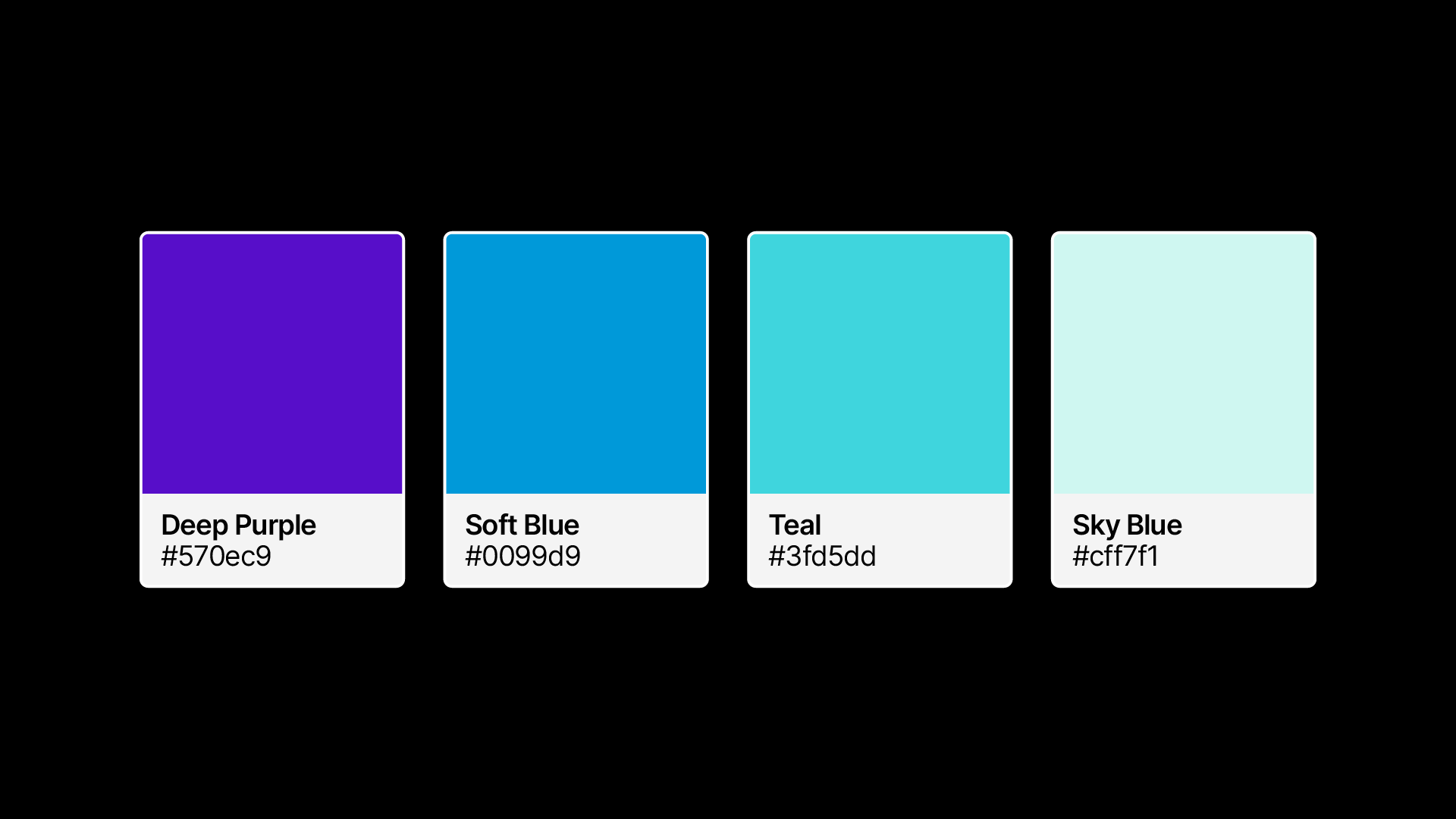
Our secondary color palette includes:
Deep Purple #570ec9
Soft Blue #0099d9
Teal #3fd5dd
Sky #cff7f1
We use these colors to highlight a specific area, call-to-action or gradient design.
However, these colors are not typically used for backgrounds and should not be a significant visual component in our brand communications.
These colors can also create a strong gradient style for use in communications such as infographics or social media content. More on gradients on the next page.
Last updated