Common Errors
Please don't do these things to our logo design(s). Thank you.
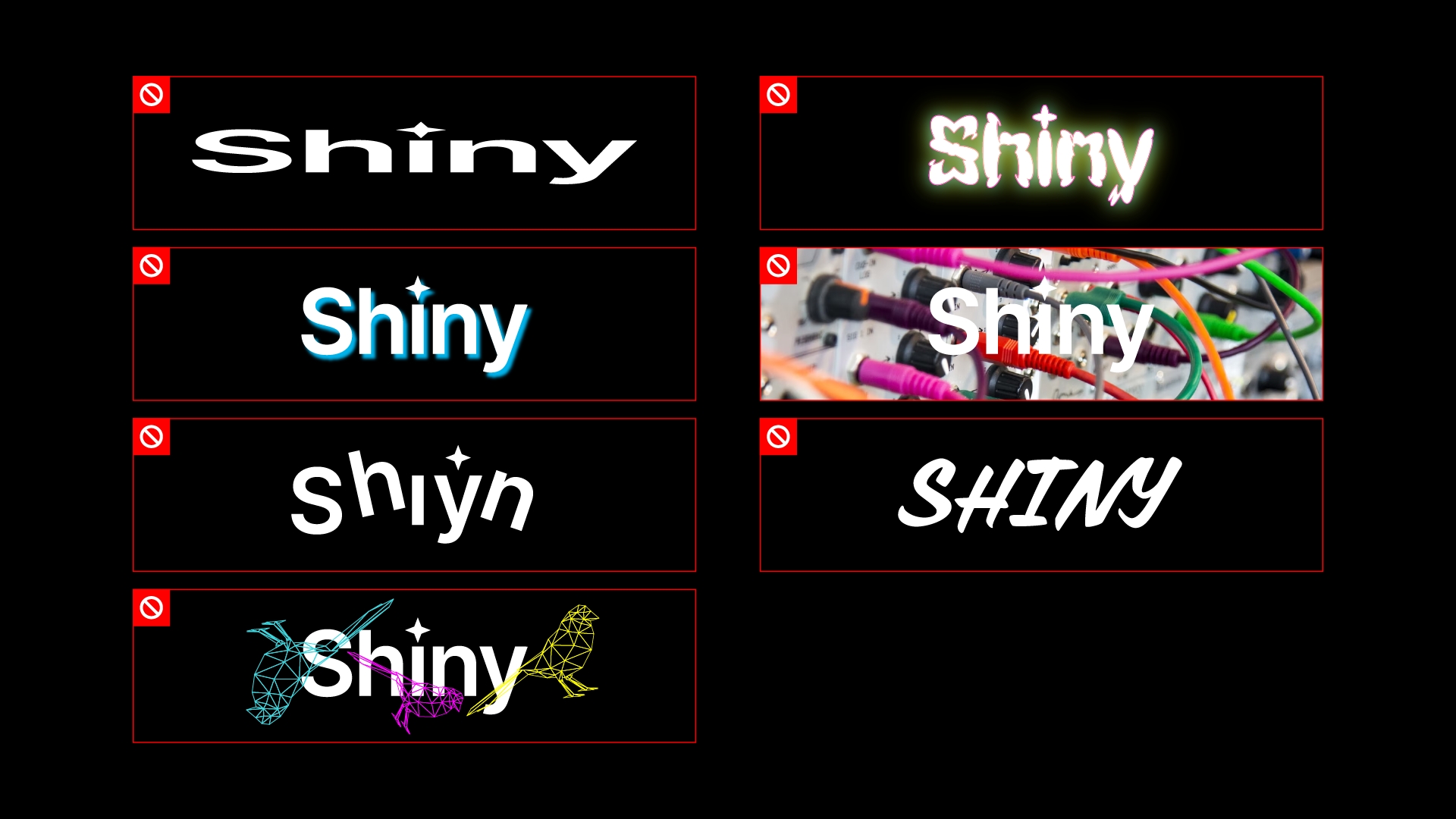
Errors from top left to bottom right:
Don't distort the logo's original shape
Don't add excessive effects or colors outside of the primary palette
Don't use heavy or colored drop shadows
Don't place the logo on busy backgrounds
Don't alter the logo's layout
Don't change the logo's typeface
Don't layer other elements too close or on top of our logo (clear space)
Note: This is not a comprehensive list of errors. These are simply the most common or egregious errors. Yes, I have seen them all which is why this section exists.
Last updated
