Background Control
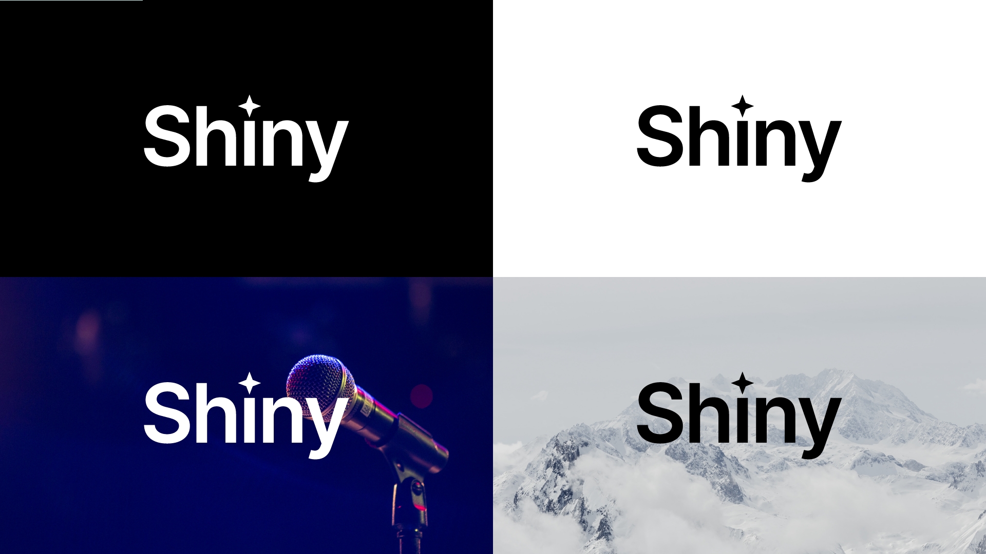
Contrast is king when considering placing the logo on any background.
Our logo should not only be legible; it should also make a clear, strong statement when used.
If there is not enough contrast between the mark and the background, the presence of the logo is weakened.
The logo may be placed on photographs, textures, and patterns as long as there is enough contrast for the logo to be visible.
Generally follow these guidelines:
White logo design on dark colors and dark photographic backgrounds
Black logo design on light colors and light photographic backgrounds
Last updated