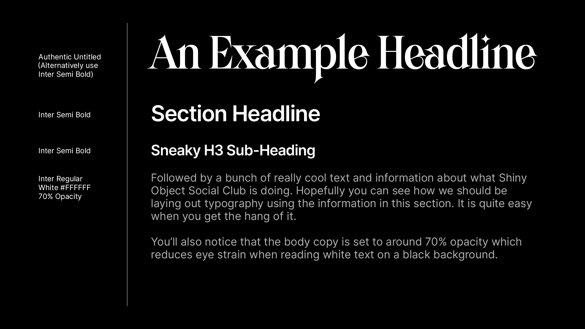
Hierarchy, Color & Weight
Inter has many different weights but, we typically prefer to use Regular and Semi Bold.
Use contrast between wider and thinner weights to communicate relevant importance, otherwise known as hierarchy, of information.
We also tend to tighten up the kerning on Semi Bold text (-30 in Adobe Illustrator, sorry I don't know Figma) as it just looks cleaner.
Body Copy:
Regular weight
#ffffff (75% opacity) or #bfbfbf for light text on black background
#010101 (65% opacity) for dark text on a white background
Please take the opacity percentages with a pinch of salt. We haven't finalised the exact number yet. I'm no web designer.
Header Copy:
Semi Bold weight for H1-4
-30 (Adobe Illustrator) tighter kerning on all text
#ffffff for light text on a black background
#010101 for dark text on a white background
Authentic Untitled can be used as a H1 alternative if desired
Our logo(s) are set in Inter Semi Bold and this is also the most commonly used weight in headlines.
Last updated